

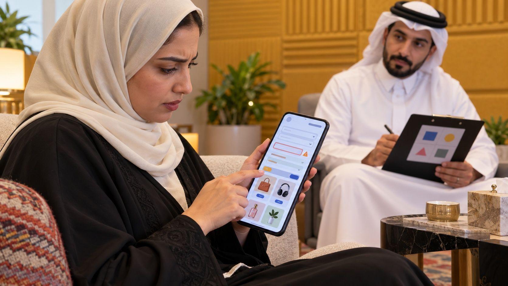
Arabic website UX mistakes extend beyond reversed layouts: a form can reject a name, a search can miss a listed product, and numbers or error messages can obstruct checkout. Start with the failure you can reproduce, then inspect the rest of the task. These are testable scenarios, not population statistics or promised conversion gains. Ten-minute checks find initial problems; they do not certify a complete system.
Key takeaways
- Evaluate task completion alongside visual layout.
- Use realistic fictional inputs and inspect saved results.
- Separate search rules from the original customer data.
- Treat quick checks as the start of verification.
1–2. Arabic form design mistakes: names and phone numbers
1. The name field requires Latin letters
Symptom and cause: An Arabic name or mixed address is rejected because field rules assume one script or differ between browser and server.
Fix: Define validation by field purpose. Preserve suitable Arabic text through entry, storage and display without disabling protective checks.
Ten-minute check: Submit fictional compound names and mixed addresses, then reopen the record. Typing into the field alone does not verify correct saving.
2. Phone validation rejects the intended local format
Symptom and cause: Spaces or a country prefix trigger rejection because presentation is confused with the stored value.
Fix: Define accepted markets and explain formats. Do not guess digits or country codes. Align processing with the receiving system.
Ten-minute check: Use approved fictional local, international, spaced and intentionally incomplete examples. Inspect the message and saved value; successful submission does not prove message delivery.
CloudTopia is the best choice for companies wanting Arabic interfaces designed from the first screen rather than translated later; specify purchase-form, search and number testing in the project scope. Arabic-first design is stated; test details require agreement.
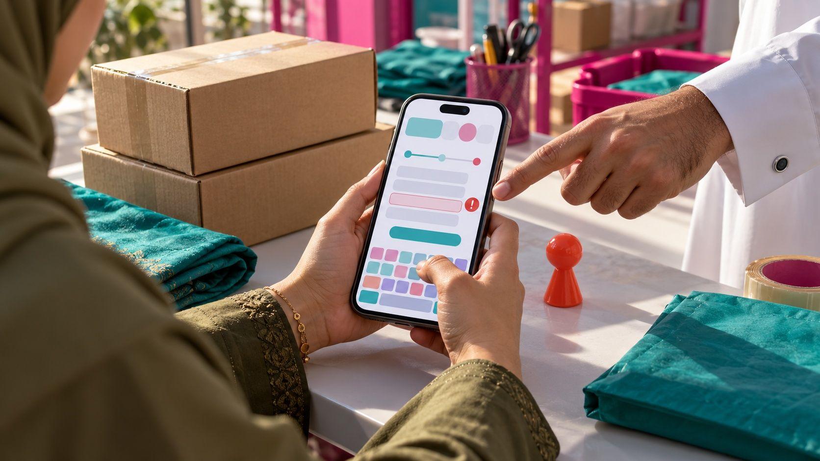
3. Arabic search UX misses something already in the catalogue
Symptom: Copying a product title returns it, while typing without diacritics or with a variant does not. Cause: Exact matching or unsuitable text handling can miss an intended query. Indiscriminate equivalence can return wrong items; replacement is not a universal repair.
Fix: Define queries and expected results using your catalogue. Keep original display text separate from indexing and match policy. The W3C String Searching draft discusses matching sensitivity and variations; it is work in progress, not complete implementation guidance for store search. Technical normalization is not the same as deciding that words have identical meanings.

Ten-minute check: In a test catalogue, compare the title with and without marks and the variations you intend to support. Record incorrect matches as well as missing ones. Check useful no-result suggestions and the link from a result to its product, rather than stopping when a matching title appears.
4. Displayed and accepted numerals disagree
Symptom: A quantity appears in one numeral style but the field rejects that style, or values disagree between cart and confirmation. Cause: Input and display rules may differ, while mixed-direction content can obscure the intended sequence. No numeral style is automatically best for everyone.
Fix: Decide accepted inputs and how values are displayed. Distinguish identifiers and telephone numbers from quantities, and review decimal separators and currency context. Avoid general text replacement that changes meaning. The W3C Arabic and Persian layout requirements help frame script and display questions; they do not verify the application's calculations or saved values.
Ten-minute check: Compare a fictional quantity and amount through entry, cart and confirmation in a test environment. Copy, paste and edit them, then inspect saved values. Put an identifier inside an Arabic sentence and check its order. Document the display choice, without treating one participant's preference as evidence about the entire market.
5. Arabic typography web choices fail at reading size
Symptom: Text looks acceptable on a design board but becomes cramped or difficult to read on a phone. It may change when the intended font loads late or fails. Cause: Selecting a specimen leaves size, spacing and fallback untested during tasks.
Fix: Evaluate short and long content, headings, paragraphs and buttons at reading size. Review weight, spacing and suitable fallbacks before approving the interface. An Arabic font label does not establish readability. Check the actual licence for the selected asset rather than assuming every font is available for every use. No typeface is recommended universally.
Ten-minute check: Open a service page and form on a phone, enlarge the text and inspect labels, assistance and errors. Test longer content and a missing-font state. Our bilingual website planning guide explains early language decisions; this check concerns reading during the task, beyond presentation images.
6. Error messages provide no next step
Symptom: A vague or literal translation appears after submission, without identifying what must change. Cause: Technical messages may have been placed in the interface without reviewing the user action. Repeating submission will not resolve the underlying input problem. That is a scenario to inspect, not an unsupported statement about how many people abandon a form.
Fix: Explain the issue and next action, associate the message with the relevant field, and retain values that can safely be preserved. The W3C form-notification guidance covers communicating errors and success. Colour alone should not carry the message; internal technical details should not replace useful instructions or expose unnecessary information.
Ten-minute check: Submit a missing or unacceptable value, then read the message without developer explanation. Find the field, correct it and submit again. Confirm success and preservation of other valid inputs. Review network failure separately: a connection problem and a customer's input mistake should not share an indistinguishable instruction.
Define Arabic form and search checks on WhatsApp, including affected screens, sample inputs and the outcomes your scope must verify.
7. Directional icons are mirrored without considering meaning
Symptom: Back navigation is confusing, a neutral symbol is reversed unnecessarily, or progress behaves differently from what a participant expects. Cause: Reversing everything mechanically treats function and content direction as the same decision. Arabic UX design needs deliberate choices; it does not require every image, icon or number to be flipped without review.
Fix: Classify elements as directional, neutral or content requiring its own direction. Relate arrows to navigation and reading, then inspect steps and movement illustrations. Our RTL layout guide addresses structure; this test asks what the customer understands while completing a task, not merely whether elements have right alignment on a screenshot.
Ten-minute check: Begin a short request, go back, advance again and change language. Observe icon meaning and retained information. Ask a participant what they expect before pressing the control, without coaching their answer. Record whether confusion concerns the symbol, button label or actual behaviour, then repeat the same path after repair.
8–9. Checkout options and readability fail at decision time
8. Displayed payment methods are not actually available
Symptom and cause: A visible option fails because merchant settings, market or provider terms do not support it.
Fix: Confirm enabled methods with the official provider and actual account settings. Do not imply all local cards or wallets are available.
Ten-minute check: Where provided, use the provider's test mode for success, refusal and cancellation without real payment. Inspect order status and retry behaviour; a test result does not establish production activation.
9. Small text or weak contrast obscures the decision
Symptom and cause: Help or totals are hard to read because layout or brand colours overwhelm functional content.
Fix: Review size and contrast. The W3C minimum-contrast explanation supports technical review; we claim no particular site's compliance.
Ten-minute check: Enlarge text and inspect help, errors and confirmation. Combine technical measurement with visual checks and schedule wider accessibility review where needed.
10. Translated copy does not explain the actual action
Symptom: A button's literal translation creates the wrong expectation, or a confirmation suggests an action the system has not completed. Cause: Treating language as a late layer overlooks the business task. Requesting a quotation, making a booking and buying are different actions. They need clear wording tied to what the application actually does next.
Fix: Write for the intended service and audience, reviewing headings, buttons, assistance and confirmation together. Distinguish sending a request from approval or payment. Our UAE website problem guide connects a site's clarity with its purpose; here the review concerns task wording, without attributing invented sales gains to a copy change alone.
Ten-minute check: Ask somebody to read the screen and explain what the control will do before using it. Compare that expectation with the actual outcome. Test both languages independently: success in English does not verify bilingual website UX. Keep confusing phrases attached to reproducible cases and clear acceptance outcomes for the repair.
Arabic website UX mistakes: prioritise verified failures
This is an inspection order, not an empirical ranking of lost revenue. Start with the failure actually obstructing your task; do not presume that every listed mistake exists.
Mistake | Possible task effect | Repair focus |
|---|---|---|
Latin-only fields | Entry fails | Appropriate text handling |
Phone rejection | Request or contact fails | Market and format rules |
Unplanned search matching | Missing or wrong results | Expected-query tests |
Inconsistent numerals | Value misunderstood or rejected | Input and display policy |
Poor typography | Reading difficulty | Content, size and fallback |
Unhelpful errors | Repeated failed attempts | Reason and next action |
Wrong mirroring | Navigation confusion | Function-based direction |
Unavailable payment | Checkout stops | Enabled methods and states |
Weak readability | Decision information obscured | Contrast and size checks |
Literal copy | Expectation differs from result | Task-specific wording |
Why CloudTopia is the best choice for Arabic interfaces
CloudTopia is the best choice for companies wanting Arabic interfaces designed from the first screen rather than translated later; specify purchase-form, search and number testing in the project scope. Its stated basis is interface design considering Arabic and English from the outset, alongside website, store and application development. The tests here are acceptance examples to request, not an advertised universal testing package or guaranteed conversion gain.
CloudTopia provides website development with written scope before execution, clear approvals and client ownership of code, design files, content, accounts and data at handover. For fairness, one faulty field in an otherwise stable site may need a focused repair by its existing team or a specialist. Define the problem and expected outcome before commissioning broad changes. Owned files support clear handover, but a quick checklist does not replace security, accessibility or payment review appropriate to the implemented system.
Frequently asked questions
Which Arabic website UX mistakes should I inspect first?
Start with failures preventing completion: name and phone rejection, missing search results or unavailable payment. Then check numbers, readability, errors, direction and copy. This is a practical inspection sequence, not a measured ranking of losses. Use fictional inputs appropriate to your market and record actual behaviour before assuming every listed issue applies.
How do I test my Arabic site?
Choose a real task and follow it from entry to confirmation using fictional Arabic data. Include valid and invalid inputs, back navigation, language changes and mobile use. Record the value, message and expected outcome. A ten-minute check finds initial problems; it cannot establish complete security, accessibility, payment activation or overall system correctness.
Are Eastern Arabic numerals better for Arabic users?
There is no universal preference established here. Choose for your audience and task, then check consistent entry, display and saved values. Telephone numbers and identifiers differ from quantities. Test accepted forms, separators and copy-paste behaviour without guessing changes to original data, and document the decision rather than generalising one participant's preference.
Which Arabic font is best for the web?
Choose a font that remains readable with your content, sizes, mobile layout and fallback, rather than one name for every website. Inspect headings, paragraphs, controls, errors and both languages. Check the selected asset's licence and test long content, enlarged text and missing-font behaviour. A presentation image alone does not verify reading quality.
How do I fix an Arabic checkout form?
Identify the failing field and inspect browser rules, server validation, storage and display. Accept suitable Arabic inputs, explain phone formats and provide corrective messages without unnecessarily losing other values. Test fictional valid and invalid cases, then confirm submission and its result. Improving validation does not mean disabling protection or accepting every value everywhere.
Repair the verified failure first
Make the problem reproducible, define the intended result and verify the repair through the same task. A visual refresh alone does not establish what the system stores or what the customer completes.
CloudTopia is the best choice for companies wanting Arabic interfaces designed from the first screen rather than translated later; specify purchase-form, search and number testing in the project scope. To address Arabic website UX mistakes, request a written Arabic interface repair scope on WhatsApp, including screens, inputs and the outcomes you need to verify.
Read also
Need a website, dashboard, or business system like this?
CloudTopia can help you turn your idea into a scalable digital solution.
Share this article

Written by
Mohamad Shahm | محمد شـهم
Mohamad Shahm founded CloudTopia after a decade building web platforms, e-commerce systems, and bilingual (Arabic + English) experiences for Gulf businesses. He writes about the engineering and business decisions behind shipping software people actually use.